Typography for the Future
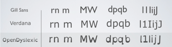
OpenDylexic Typeface
OpenDyslexic is a new open sourced font created to increase readability for readers with dyslexia.
Letters have heavy weighted bottoms to indicate direction. Readers are able to quickly figure out which part of the letter is down which aids in recognizing the correct letter, and can help to keep your brain from rotating them around.
OpenDyslexic is free to use, open source font which is continually updated through feedback and research.
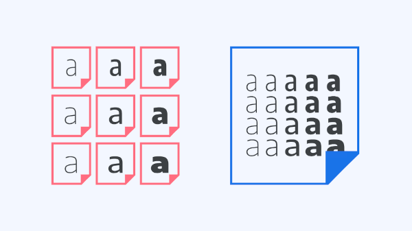
Variable Fonts
With variable fonts, the choice of exactly how heavy or slanted or wide (or any other parameter) type should be is placed into the hands of the user, rather than having those decided for us by the type designer.
Traditionally, all possible weights and styles have been separated out into different font files, whereas variable fonts combine all of those variations into one.
Because of this, overall file size is greatly reduced compared to loading multiple individual font files and thats a key consideration for web typography.
For Your Next Project: Typography Tips
Best Typography Practices
There are thousands of typefaces available, with new ones constantly being released; along with the different color, sizing, and style options, there is more freedom than ever before. It's incredibly important for designers to be thoughtful and precise with their typography choices, in order to communicate clearly.
- Consider the Text:
- Read the text in its entirety before deciding on your typographic elements.
- Practice Restraint:
- Limit the number of competing elements, good typography doesn't usually require more than a few weights.
- Be Aware:
- There are numerous displays your designs may be viewed on, stay informed and adapt your designs to these environments.
Common Typography Mistakes
In the beginning, scribes were manufacturing books or documents by hand. The first typefaces were modeled on forms of calligraphy to mimic the handwriting of scribes.
- Don't use too many typefaces or styles
- Best practice is to use 2 typefaces (1 body text and one display/header typeface) to avoid being distracting the users.
- Don't forget to kerning large type
- Kerning is the adjustment of space between 2 letters
- This prevents awkward spacing of larger letters or capital letters and makes the font look more professional.
- Don't feel the need to fill up all the negative space - leave some room for your design to breathe
- Negative space is a useful tool and will help define groups of information/ elements.
- Don't forget the importance of type hierarchy
- It is important to organize your information in order of importance and provide visual cues to help users make sense of the relationships between things.
- Things that are more important should be more prominent (larger, bolder, in a distinct color, set off by more white space, etc.)